Programming User Interfaces - Assignment Sequence
Applying foundational design thinking skills to HTML-CSS-Javascript to create usable, thoughtfully designed interfaces
Introduction
Programming User Interfaces is a core course offered under Carnegie Mellon University's Human-Computer Interaction program.
The class covers a range of relevant topics and skills in UI/UX design: iterative design, input-output techniques, how to design and evaluate interfaces, and research topics that will impact the future of UI.
In this assignment, we covered a number of prototyping tools and techniques.
Using these skills, I took a simple business concept and created UI prototypes in various stages of fidelity, ranging from paper prototypes to animated mockups to fully functional programs.
We had a number of business concepts to choose from, and I chose a concept called "Bun Bun Bake Shop," an artisan cinnamon roll shop that offers delivery in the Pittsburgh area.
This is an ongoing class design project.
The ultimate goal is to familiarize myself with various design/evaluation/prototyping skills and become more proficient in HTML-CSS-Javascript.
QUESTION
How can I iteratively design a customer-friendly usable interface that highlights the business's value proposition for its consumers?
Ideation
Project background
Coming from a business background, I think that one of the main considerations in my designs is how I can highlight my client's value proposition to customers.
That is: in what ways does this firm seek to benefit its customers? How can I highlight these benefits and make them accessible to users?
For Bun Bun Bake Shop, that value was customizability.
Their product offering was simple: 6 roll flavors, 4 glaze flavors, and 4 quantities.
However, customers can choose any combination of these three attributes, which greatly increases their product variety.
I centered my designs for Bun Bun Bake Shop around emphasizing this flexible product selection process.
Paper Prototyping
Initial paper prototypes
I started out by taking the concept and creating some rough (~20 minute) "paper" prototypes, playing around with different information architecture and layouts.
The goal was to get a diverse range of ideas onto the drawing board, so that I could go back and refine the most effective bits and pieces into the next iteration of my prototype.
Since I intended to use these prototypes in a user test, I had to go back and clean them up a little bit.
I converted the largely illegible handwritten text to type, and did some element grouping/reordering that would smooth the process of my virtual paper prototype testing session.
User Testing on Paper Prototype
For my user test, I started out by assigning the test user a certain task (in this case, it was to order a certain type of cinnamon roll).
Once my test user successfully completed the task, we walked through the prototype together and the user had the opportunity to ask clarifying questions or make comments about the prototype.
I wanted to get a fresh pair of eyes on these designs, especially since I frequently order food online - what might seem intuitive to me might be confusing to someone else.
I was also curious to see which designs would take the user the least amount of time and "clicks" to accomplish their given task.
INSIGHTS FROM PRELIMINARY USER INTERVIEW
1. I need to identify user expectations and standard practices of online purchasing platforms.
There are common practices across online purshasing platforms (i.e. locations of certain features/information) that allow users to easily navigate towards the ultimate goal of making a purchase, even if it's their first time using the platform. On the flip side, users might have trouble figuring out UIs that deviate from these practices.
2. Users prefer UIs with information architecture that matches the content scope and depth.
One prototype heavily referenced big-name online shopping UIs. While emulating these UIs enabled my user to easily figure out how to use this particular design, I noticed that it took more clicks and more time to complete the purchase task. My test user noted this as well, saying that a simpler layout might have better represented the limited product selection of Bun Bun Bake Shop.Final Wireframe
I used the insights gained from my preliminary user test to create a finalized initial wireframe.
I decided on a one-page order form layout that refreshed once the product was added to the cart (think Chipotle).
Based on the task completion times and my test user's feedback, I felt that this was the most comprehensive layout.
This design also emphasizes the customizable aspect of Bun Bun Bake Shop's products, which fell right in line with my goal of highlighting the flexible product selection process.
Final wireframe
Prototyping on Figma
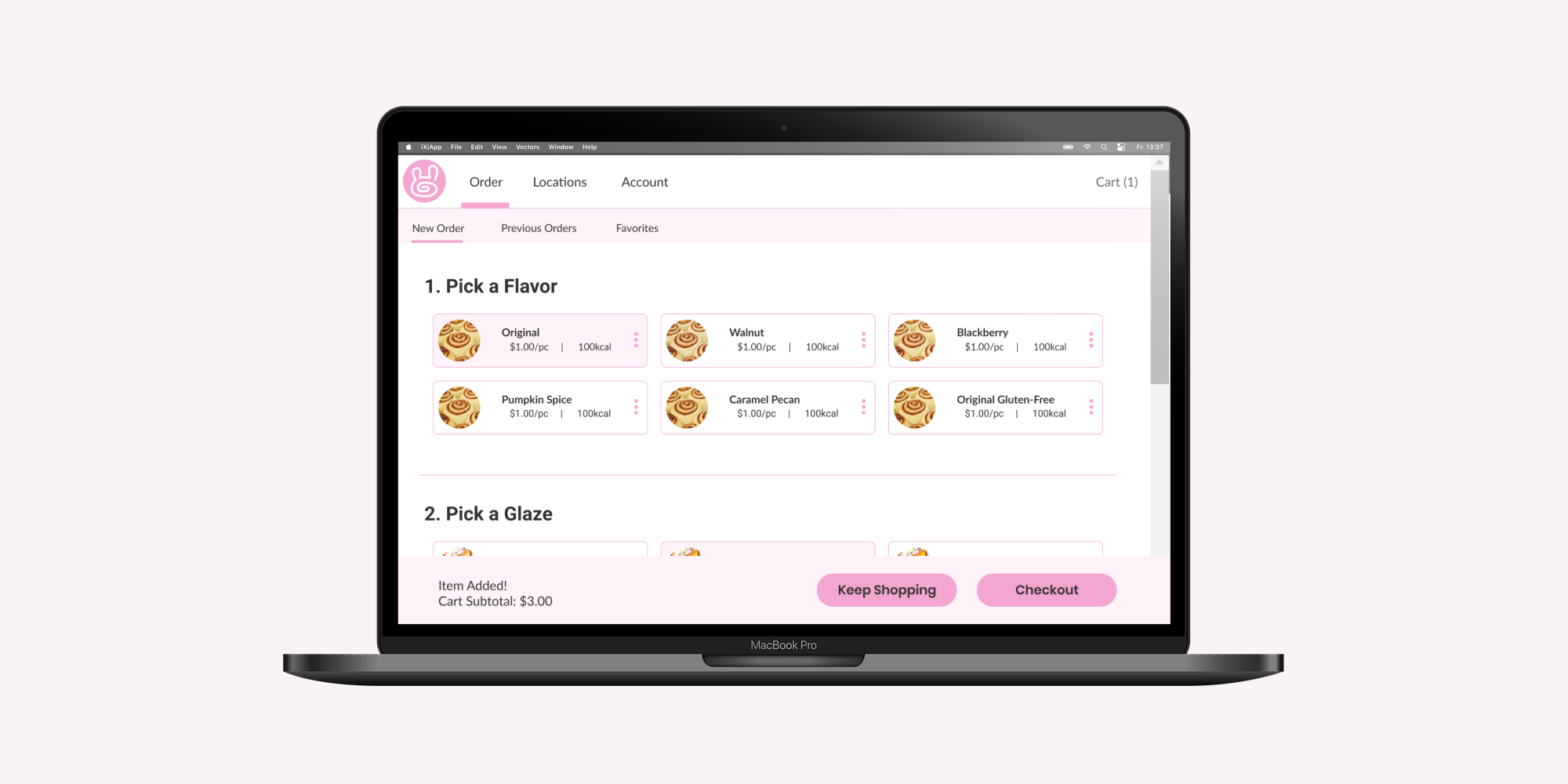
For the next stage of the assignment, I converted the wireframe to a high-fidelity prototype on Figma.
I added some more pages with increased functionality, allowing users to save past orders/favorite items, find a store location near them, and make an account.
I also added more to the checkout process, closely referencing other online purchase UIs to get an idea of what users expect to see on their purchase journey.
Basic sitemap
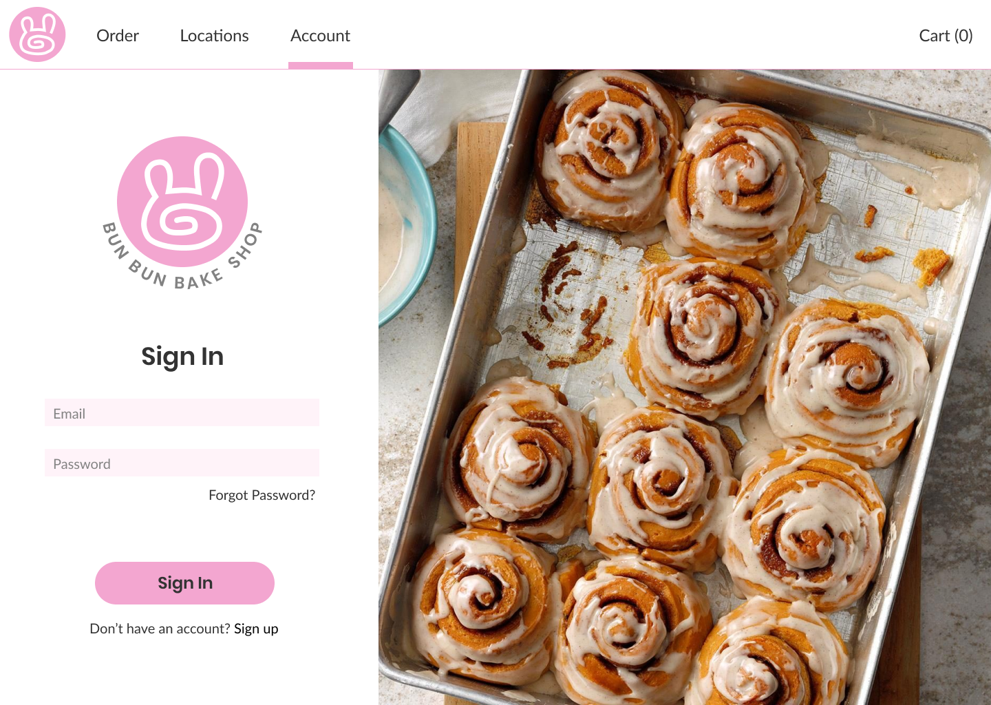
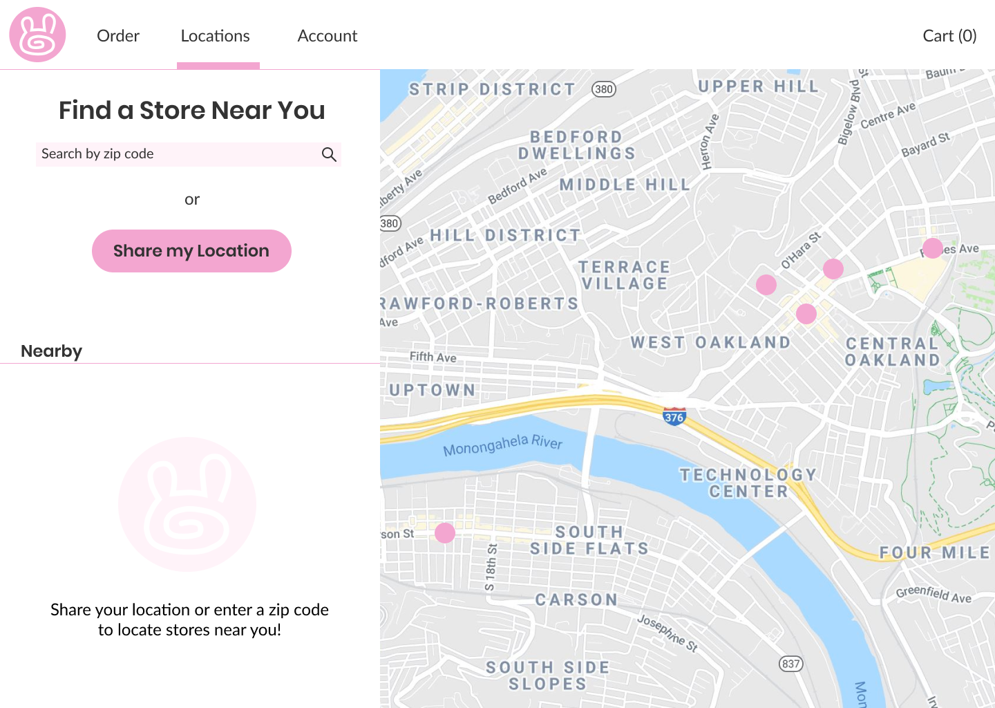
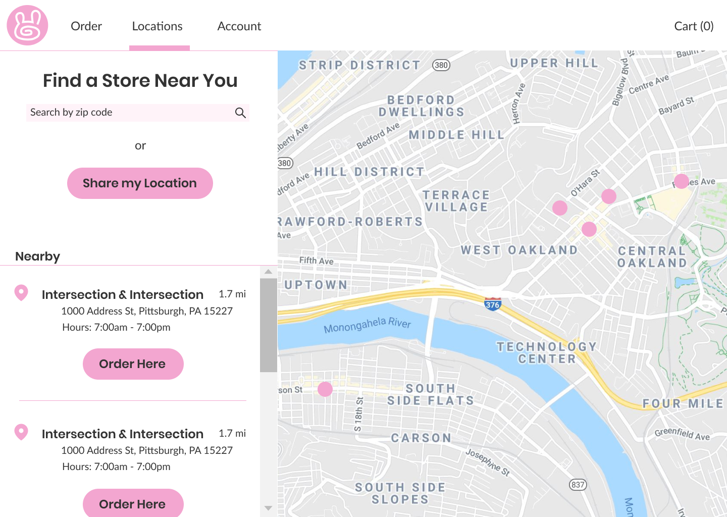 New features: login, location
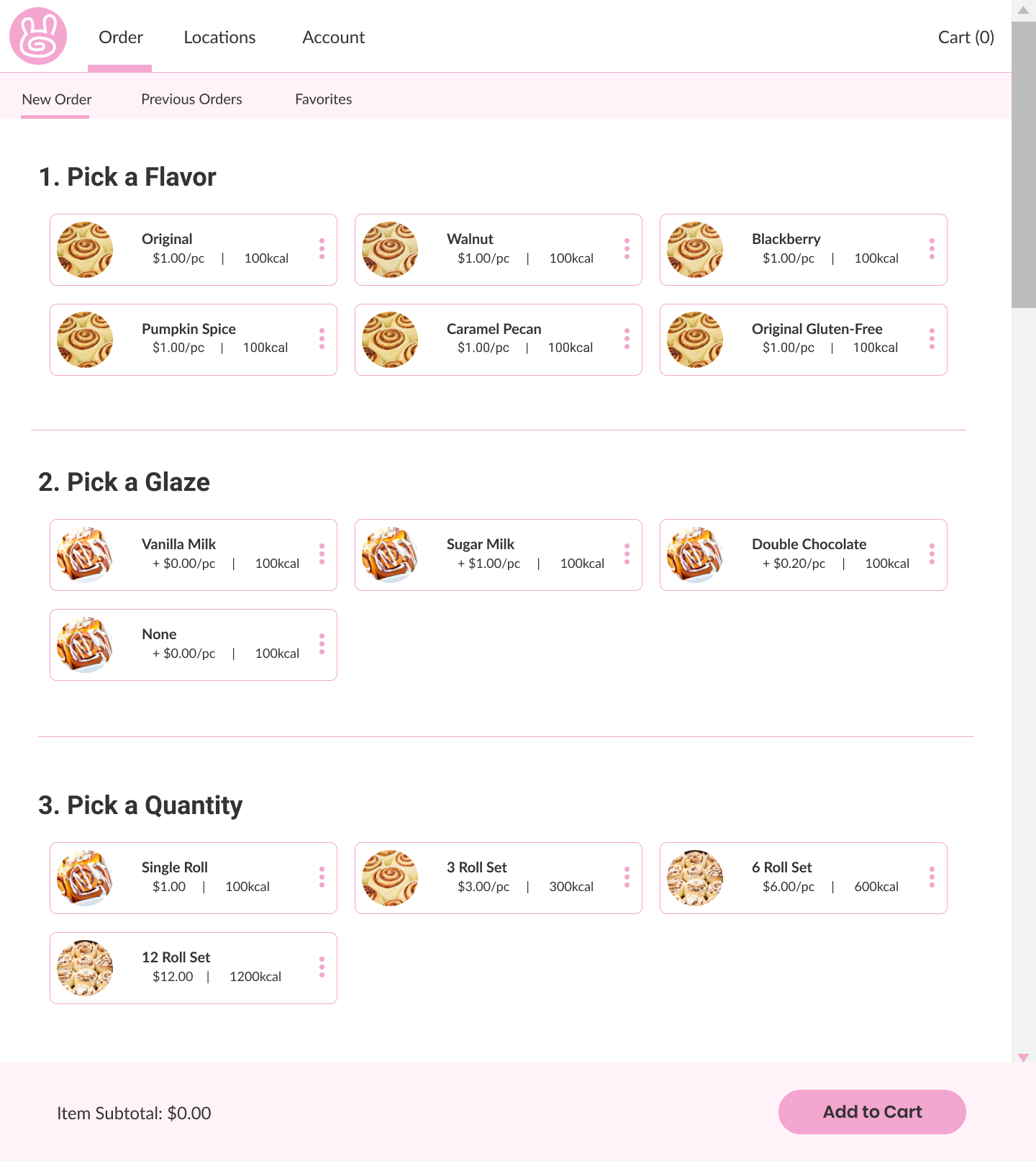
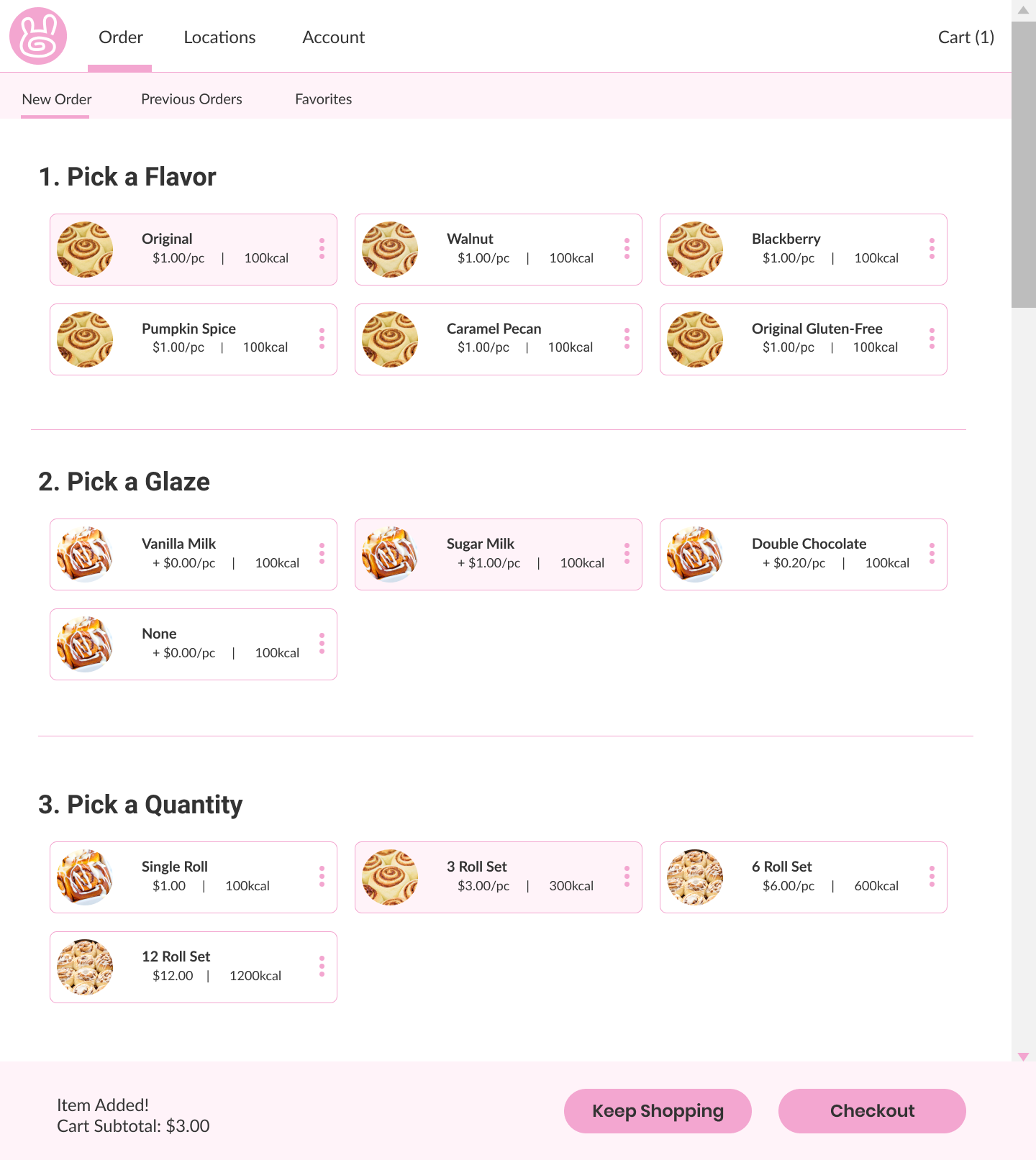 Order form before and after selections
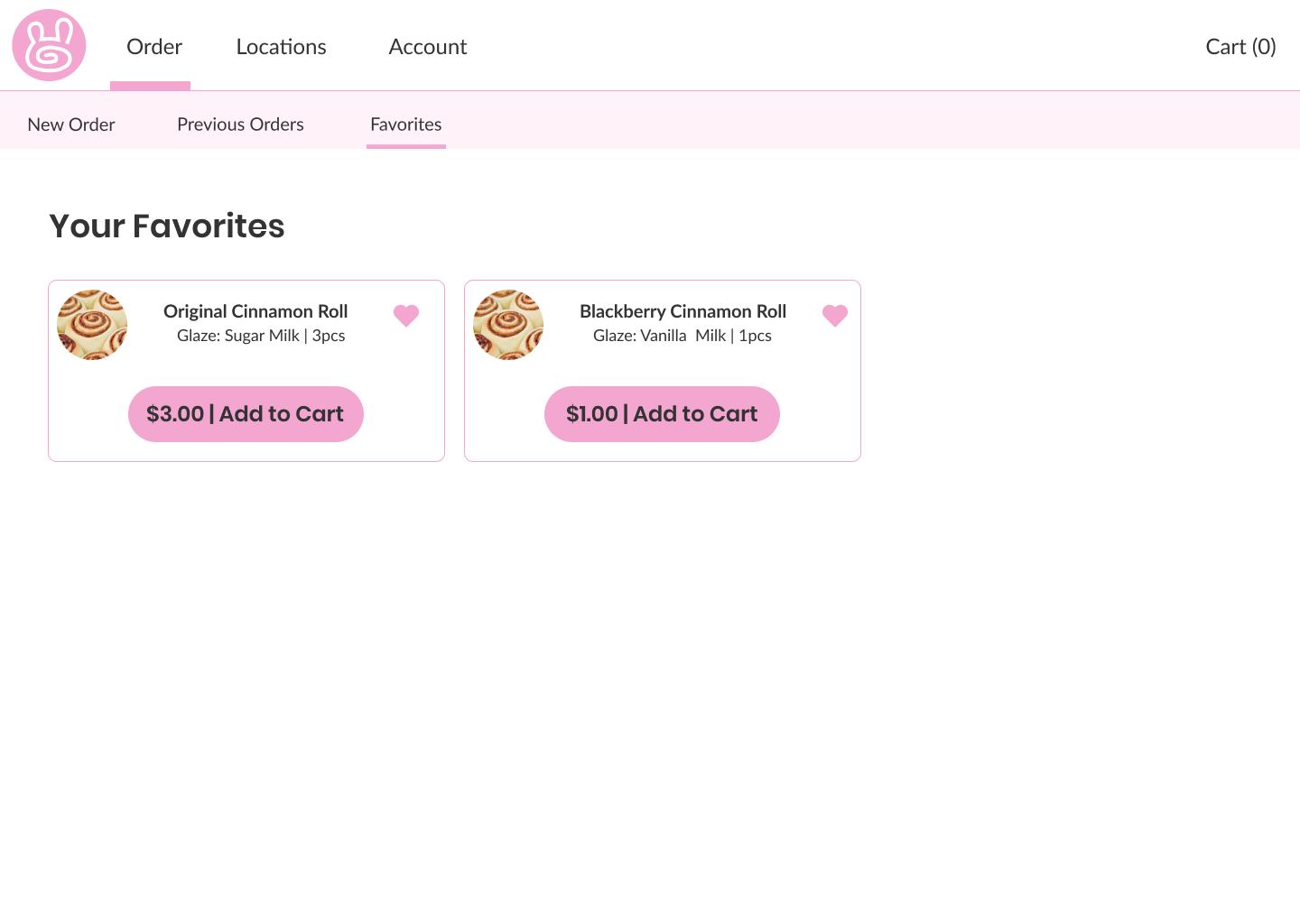
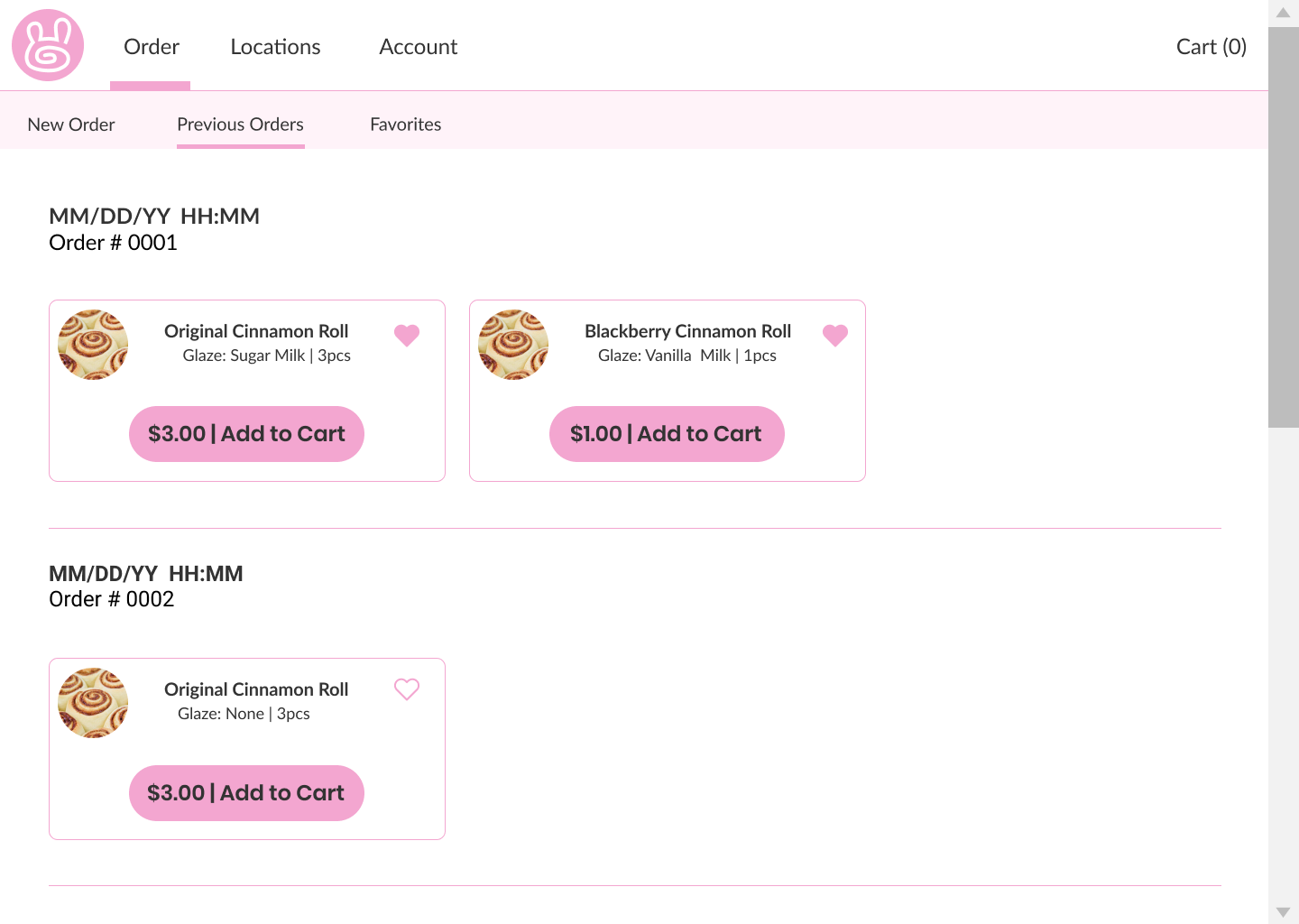 Order saving options: favorites and previous orders
I also linked some of the pages together using the Figma prototyping tool so you can click through it as if it was a real website!
Check it out below:
This project is ongoing, but I'll be updating with any progress I make!